
Here's a bit of iconoclasm for you: I've been bothered for a while by the design of the American flag.
Too many stars, too many stripes. It's just too busy.
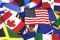
Whenever I see a long row of flags from different countries waving in the breeze, I'm reminded again that the flag of the U.S. does not fit in. The other flag designs utilize larger areas of solid color and as a result are stronger, better designs. The U.S. flag's red and white awning stripes produce a pattern that's too jittery, and the white stripes dilute and lighten the red so much that the flag stands out awkwardly when flanked by the substantial greens and reds and golds of other flags.
When you think about it, don't the awning stripes remind you of a dish towel or a bedspread or, well, an awning? I understand how the flag evolved and how it was a product of its context. The designers modified the busy-ness of the British flag, with its superimposed red crosses separated from the blue field by thick white margins. But the design coherence created by the central intersection of the crosses was lost by making all the stripes parallel and thrusting into them a starkly contrasting upper-left quadrant, or "canton." So, to remedy that, I propose several stronger designs.
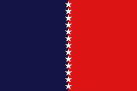
This design draws on the elegant simplicity of the European Union flag, with its ring of small gold stars over a solid blue field. By vertically dividing the field here into two colors, the design seems to illustrate "Out of the original colonies has evolved a nation deeply divided into red states and blue states."

Keeping the divided field, I replaced the small stars with larger stars representing the three branches of government which tenuously hold together the "separate but equal" red and blue states.
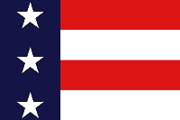
This design should be easy to accept because it keeps the current flag intact and simply enlarges a segment of it from the right edge of the canton.

This is another design which enlarges a segment of the existing flag, this time from the bottom edge of the canton.
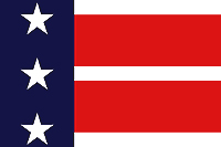
Reducing the height of the white stripes creates an equals sign (=) from the red stripes.
An important consideration in flag design is how it appears at a distance. The current flag's red and white stripes are so small and intricate at a distance that they dissolve into pink. I doubt many people in the U.S. would consciously choose to be represented by a pink flag.
4 comments:
Dan, you idiot.
Don, your flag designs are quite an improvement over Old Glory. But since she's jittery and out of place among other nations' flags, the official one is also a painfully accurate representation.
If and when we change the character of America, perhaps we can all agree on something a little less busy.
Do you even know why the Flag has 13 bars or why it has 50 stars or what the colors represent?
If you'd like to move to a country w/ a less "busy" flag might I suggest France, theirs is pure white.
"Do you even know why the Flag has 13 bars or why it has 50 stars or what the colors represent?"
Of course I do. And so do my readers. I didn't need to belabor the point.
Ah, yes. The old LOVE IT or LEAVE IT mantra. Archie Bunker was awfully fond of that one!
Some things never change.
Post a Comment